One of the most beautiful art journals ever printed was Ver Sacrum, published in Vienna from 1898 to 1903. Ver Sacrum was a team effort led by Gustav Klimt, who was the first president of the Vereinigung Bildender Künstler Österreichs, the Viennese avant-garde movement, with offshoots in Paris, Brussels, and Munich.
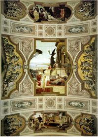
Born in Vienna in 1862, Gustav Klimt received training as an architectural painter and decorator, along with his brother. They were commissioned to embellish monumental new buildings in the Austrian capital, and their achievements included majestic ceilings in the Burgtheater, and murals in the Kunsthistorisches Museum. Their style can be characterized as neo-classical, majestic, and somewhat pompous [Ill. 1].
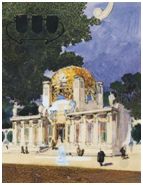
In the 1890s, however, Gustav Klimt turned to radical experimentation. In 1893, he began work on his last public commission for the State; however, his project for the University of Vienna was criticized by conservatives even before it was unveiled to the public. As a result, along with twenty other artists, Klimt abruptly resigned from the exhibition venue dominated by the Establishment, and founded the Secession Movement. To promote their esthetic(s), The “Secessionists” created their own exhibition space [Ill. 2] and their own journal, Ver Sacrum (1898-1903). Ver Sacrum means “Sacred Spring” in Latin: for Klimt and his friends, it was the beginning of a new era – an era which, alas, would end tragically in 1914 (as Stefan Zweig’s memoirs Die Welt von Gestern show, no one seemed to be aware of the danger, but this is another story). Today, a very pleasant place to admire Secession art is the Neue Galerie in Manhattan (Upper East Side).
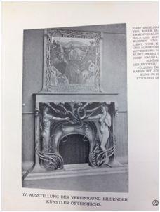
 The first issue of Ver Sacrum came out prior to the first Secession exhibition, which took place in March 1898, and the notion of exhibition remained very important for the editors of the journal. Not only the magazine covered actual exhibitions of art and design [ill. 3], but each and every issue was conceived as a small exhibit. In April 1898, the editor-in-chief, Alfred Roller, expressed his enthusiasm in a letter to Klimt in the following terms: “I am holding fast to the principle that every edition of V.S. is a small exhibition, but that V.S. as a whole is a large one” [my emphasis].
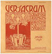
 Let us look at the first issue. The three shields on the cover [Ill. 0], designed by Roller himself, symbolized painting, sculpture, and architecture, even though Ver Sacrum would also promote the decorative and performing arts. The shields are shown growing from a tree whose roots have broken free from the container — most likely, a symbol of the Secession movement’s breaking out of the conventional and constraining art world of Vienna. This iconography was used again in the issues of August 1898, December 1898, and October 1901.
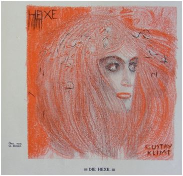
Furthermore, the monthly journal would regularly resort to avant-gardist rhetoric — especially in the first years. For example, the issue of February 1898 opened with Gustav Klimt’s amazing portrait of a witch (Hexe) — a symbol of heresy and marginality [ill.4].
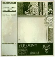
Another example: the cover for May/June 1898 [ill. 5] was a reprint of Klimt’s poster for the first exhibition of the Secession five months earlier. Under the gaze of Athena, goddess of the arts, Theseus is slaying the Minotaur — thus freeing the Athenian youth from fear: clearly, this was an allegory of the ongoing battle between the avant-garde and the traditionalists!
Finally, Ver Sacrum reproduced a picture of the Secession Building, with the proud motto inscribed above the entrance: “Der Zeit ihre Kunst Der Kunst ihre Freiheit” That is: “To Time its Art; To Art its Freedom”!
 Again, each issue included printed or pasted reproductions of paintings and objects displayed in the Secessionist exhibitions; drawings and designs made especially for the journal, almost always signed by each artist – see, for example, the typographical ornaments or “book jewelry” (Buchschmuck) designed by Hoffmann, Kolo Moser, or Josef Maria Olbrich [ill. 6]; tentative designs for furniture or interior decoration that could be created on demand: for example, “wallpaper for a young girl’s bedroom” or for a Jagdzimmer (“hunting room”) in April 1899; and even musical scores!
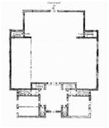
As pointed out by several art historians, the square format and the wide margins provided an original and flexible template to present a great variety of graphic designs in an elegant setting. The magazine followed the demanding concept of a Gesamtkunstwerk inasmuch it not only accounted for the most recent innovation in various artistic fields (literature, visual arts, architecture, design, music), but also sought to integrate typography, “ornament/jewelry”, and illustrations into a unified work. Finally, the square format is also evocative of the cubic shape of the exhibition hall designed and built in 1897 as an architectural manifesto for the Vienna Secession which I mentioned earlier [Ills. 7 and 8].
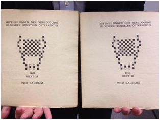
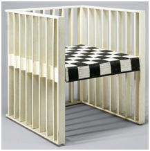
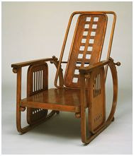
 Squares would often be repeated and used to frame a text (poem, or essay), in contrast with curvilinear and languid motives: for example, the stylized and sensual floral designs by Josef Achentaller would offer a strong contrast with the strictly geometric pattern of the page. In September 1901, Koloman Moser introduced a series of black and white square designs he referred to as “typographical decoration” to illustrate a series of poems by Arno Holz. The checkered tiles of black and white squares which appear on the covers of Heft (issue of the magazine) 19 and Heft 20 were certainly a source of inspiration for the 1903 armchair, and later for the “Sitzmachine” (“machine for sitting”) designed by Hoffmann for the Purkersdorf Sanatorium in Vienna in 1905. Once again, the continuum between graphic designs created for the magazine, and patterns used for the commercial manufacturing of high-quality furniture and decorative objects, is evident. [Ills. 9, 10, and 11]
![Ill. 12: Essay on Japanese Art by poet and art critic Ernst Schur: “Der sogenannte Japonismus war nur eine Mode […]. Wir sind wie unerzogene Kinder, die ihren Vater nicht verstehen können” (the so-called Japonism was only a passing fad… we are still like uneducated children who cannot understand their own father) Essay on Japanese Art by poet and art critic Ernst Schur](https://rarebooksdigest.com/wp-content/uploads/2014/05/Ver-Sacrum13.jpg) Japanese art held a special fascination for the Secessionists, who wanted to move beyond trendy and superficial “Japonismus”, and in 1900 they dedicated their sixth exhibition to “the spirit of Japan art” [Ill. 12]. Japanese motives and techniques appeared frequently in the magazine.
Japanese art held a special fascination for the Secessionists, who wanted to move beyond trendy and superficial “Japonismus”, and in 1900 they dedicated their sixth exhibition to “the spirit of Japan art” [Ill. 12]. Japanese motives and techniques appeared frequently in the magazine.
![Ill 13: In his 2012 book Graphic Design, Stefan Eskilson describes the cover designed by Moser for the February 1899 issue as follows: “[Moser] drew an allegorical female figure emerging from lush tendrils that create powerful abstract forms. The flattened planes of her face suggest the influence of Japanese aesthetics; while the subject resonates with the Japanese tradition of [“beautiful person picture”]. The decorative lettering features the same sense of flow as is found in Japanese art.” cover designed by Moser](https://rarebooksdigest.com/wp-content/uploads/2014/05/Ver-Sacrum15.jpg) In his 2012 book Graphic Design, Stefan Eskilson describes the cover designed by Moser for the February 1899 issue as follows: “[Moser] drew an allegorical female figure emerging from lush tendrils that create powerful abstract forms. The flattened planes of her face suggest the influence of Japanese aesthetics; while the subject resonates with the Japanese tradition of [“beautiful person picture”]. The decorative lettering features the same sense of flow as is found in Japanese art.” [Ill. 13]
In his 2012 book Graphic Design, Stefan Eskilson describes the cover designed by Moser for the February 1899 issue as follows: “[Moser] drew an allegorical female figure emerging from lush tendrils that create powerful abstract forms. The flattened planes of her face suggest the influence of Japanese aesthetics; while the subject resonates with the Japanese tradition of [“beautiful person picture”]. The decorative lettering features the same sense of flow as is found in Japanese art.” [Ill. 13]
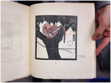
So, as you can see, there was a lot to enjoy. Unfortunately, making such a luxurious journal costs a lot of money. After a less than three years, the original (large) format was abandoned, and fewer copies were produced. Ver Sacrum became mostly an internal communication tool for the movement – but it was still published, twice a month, with more illustrations. In the last issue, Marcus Behmer, who was only twenty-four years old, created a stunning woodcut, “Der Tod im Baum” (“The Death in a Tree”) [ill. 14], perhaps a melancholy and bitter reference to the tree with the three shields of the first issue?
It must be stressed, however, that the closure of the magazine was not the end of the Secession group, which Klimt left in 1905. But one may be argue that Ver Sacrum remained unequalled and unsurpassed as an art magazine. It is a matter of taste, naturally.
****************
Thank you to Eisha Neely for helping me with photographic reproductions.
The Heidelberg University Library has digitized the entire collection.
Moser, Armchair, 1903 Neue Galerie New York Photo: ©Neue Galerie New York
Hoffmann, Sitzmachine, 1905 – MOMA Photo © MOMA New York
Call# for the complete set of Ver Sacrum at Kroch Library (Cornell), Division of Rare Books and Manuscripts: N3 V47++
{ 0 comments… add one now }